ACR
A luxury developer's standards brought to digital, even when it comes to selling pre-owned homes.
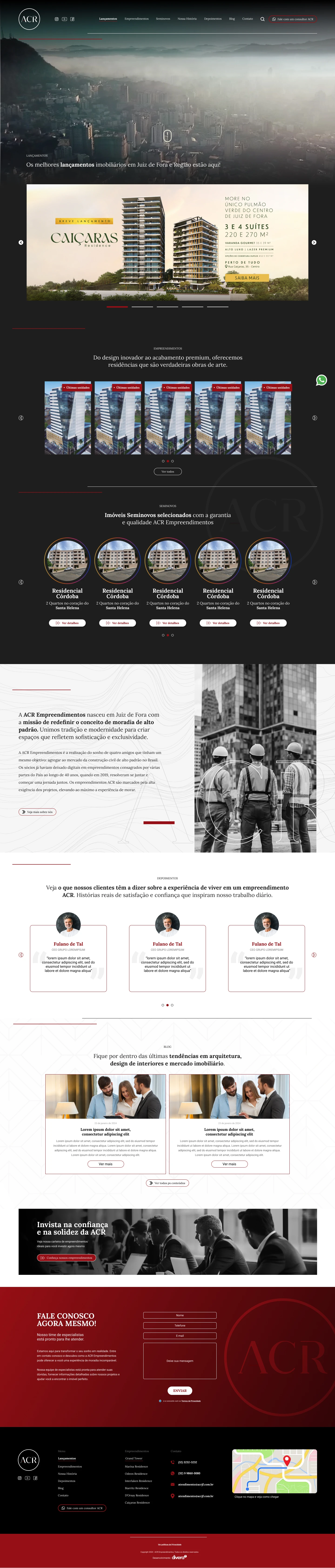
A high-end developer with no digital presence of its own
ACR builds high-end residential projects in Minas Gerais, Brazil. Until this project, the brand only existed on social media.
Buyers of homes priced from R$ 600k
Social media only, no website
Promote new developments
Sell pre-owned homes received as trade-ins
From briefing to handoff
At the briefing, I brought UX and UI questions to align with the client on how the high-end feel should come through on the site.
What makes a website feel high-end?
Three choices, all serving the same sense of sophistication and aligned with ACR's branding.
Serif typography
Lora: detail and refinement, like the finishes in the buildings.
A restrained palette
Graphite and white, with the brand red only as an accent. The property photography is the site's color.
White space
Breathing room as a sign of exclusivity, not leftover space.
How do you sell pre-owned homes without breaking the high-end experience?
A typical listings portal
A dense grid, filters, ads and lots of text. Listings portals are cluttered by nature, and copying that model would contradict everything the rest of the site was building.
The ACR website
Clean navigation, consistent with the branding and with the buyer's profile.
A pattern everyone already knows how to use
Instead of a listings showcase, I proposed a section inspired by Instagram stories: familiar, light and with no learning curve.
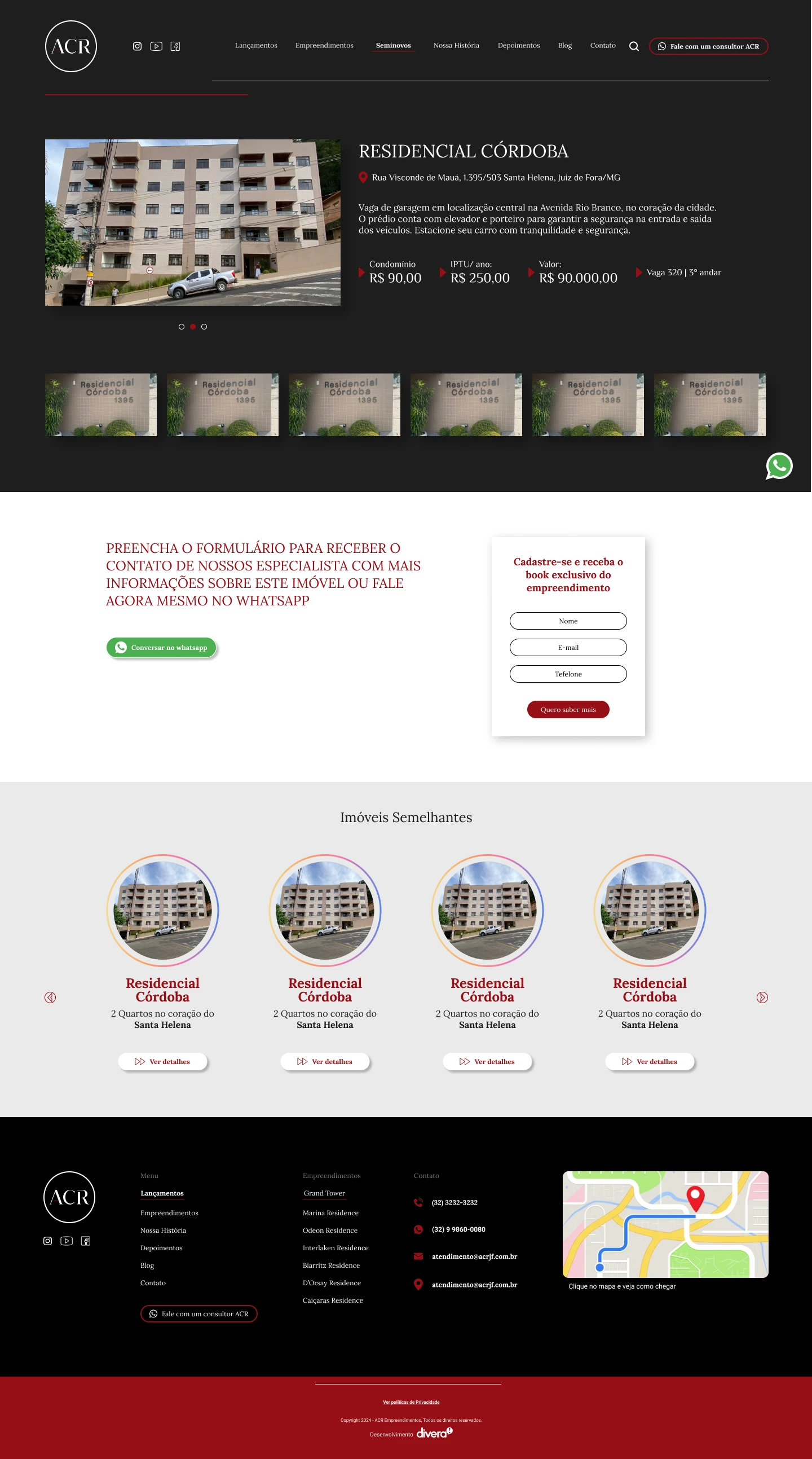
Each circle is a property
The section shows up on the page as story bubbles.
Only the property matters
The rest of the page dims and the property opens with photos and details.
One step to the sales team
The “I'm interested” button goes straight to ACR's sales team.
Why it works: buyers already know the gesture, the section doesn't clutter the page and the high-end look stays intact, on desktop and mobile.
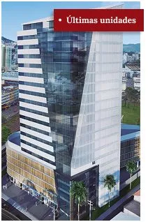
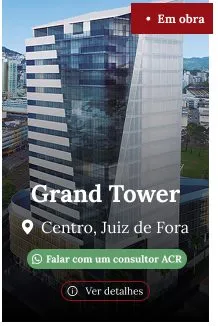
New developments in the spotlight

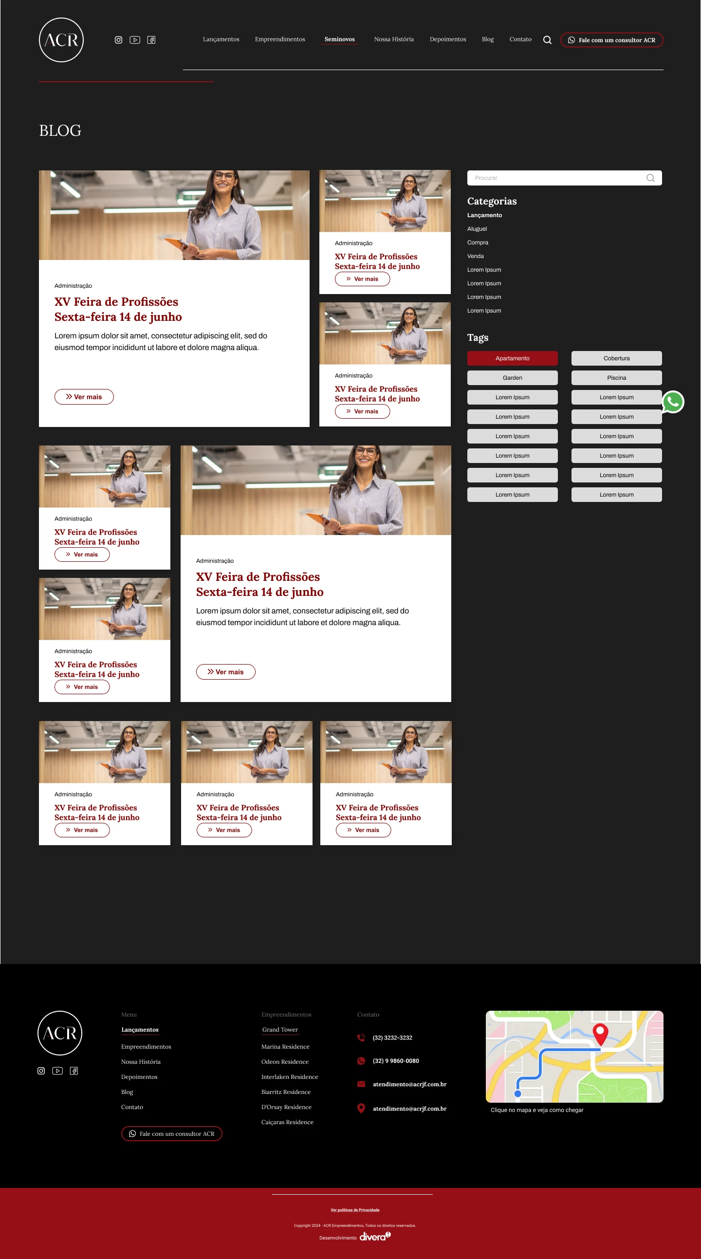
A foundation ready for development
Components and styles organized in Figma for a clean handoff: typography, colors, buttons, property cards, stories and the contact form.
Approved by people who know brands
0
change requests: the project was approved by the client and by an external communications consultancy from Belo Horizonte, which reviewed the site and suggested no changes.
Sophistication is a UX decision too: what you choose not to show matters as much as what you show.